Klink Design System
The token and component layer under every Klink screen. One set of components runs in light and dark mode, and takes each customer's brand color without a redesign. Switch the theme or pick a brand below.
- Role
- Creator, designer and builder
- Product
- Themeable design system for a B2B SaaS
- Platform
- Web, React + Tailwind
- Status
- Live, in production
- theme
- light
- --primary
- #2450f0
- --primary-foreground
- #ffffff
- customer
- Klink default
The problem
Klink is sold to companies that each have their own brand. A bank wants green, a telco wants red, a retailer wants yellow. Agents sit in the product for whole shifts, so dark mode is a must, not a bonus. If every screen were styled by hand, every customer and every theme would multiply the work, and the product would drift a little further with each one.
- Many brands
Each customer expects Klink to look like their own tool, starting with the primary color.
- Two themes
Light for the office, dark for long shifts and night teams. Both must be first class.
- One product
One codebase and one team. A brand can never mean a fork of the UI.
The idea
Components never use a raw color. They use a role: background, foreground, muted, border, primary. A theme is only a set of values for those roles. Light, dark and every customer brand are just different value sets, plugged into the same components.
- 01ScalesGray, primary, error, warning and success, each from 25 to 900. Raw values live only here.
slate/500, red/500 - 02RolesSemantic tokens that components use, with a value per theme. This is where light and dark split.
muted-foreground - 03BrandThe one value a customer sets. Its foreground and soft tints are worked out from it.
primary - 04ComponentsButtons, inputs, tables and pickers. They only ever read roles, so they never need a change.
bg-primary
Contrast on any brand
A customer can pick any color, so the text on it cannot be fixed. The system checks the brand color and picks light or dark text for it, so a yellow button gets dark text and a blue one gets white. Every color pair is checked against WCAG 2.1 contrast, in both themes.
- AssignBluelight text6.0:1
- AssignAmberdark text10.8:1
- AssignRedlight text4.8:1
- AssignGreendark text5.7:1
- AssignVioletlight text5.7:1
- AssignCyandark text8.3:1
- AssignEmeralddark text8.0:1
- AssignFuchsiadark text5.8:1
- AssignIndigodark text4.5:1
- AssignLimedark text10.2:1
Foundations
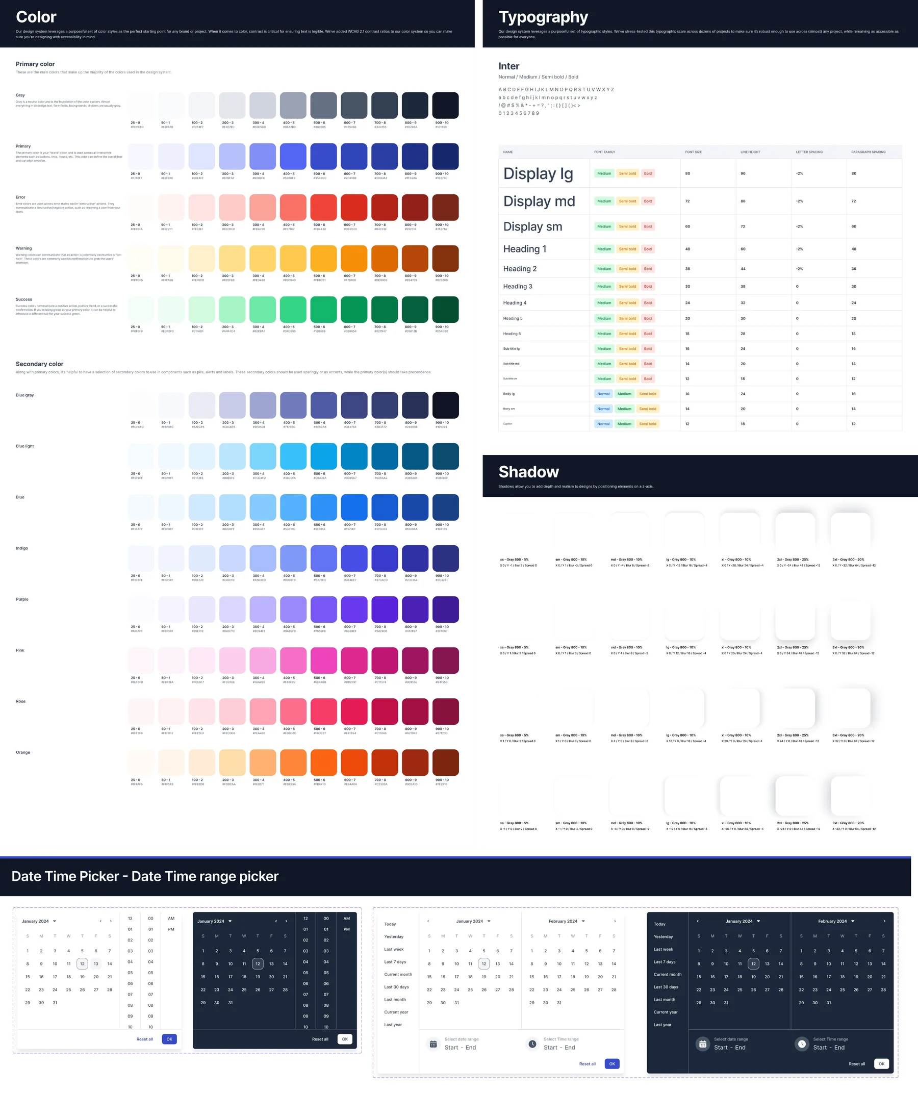
Color scales, a type scale from Display lg down to Caption, and seven shadow steps, documented in one sheet that matches the code.
Color modes
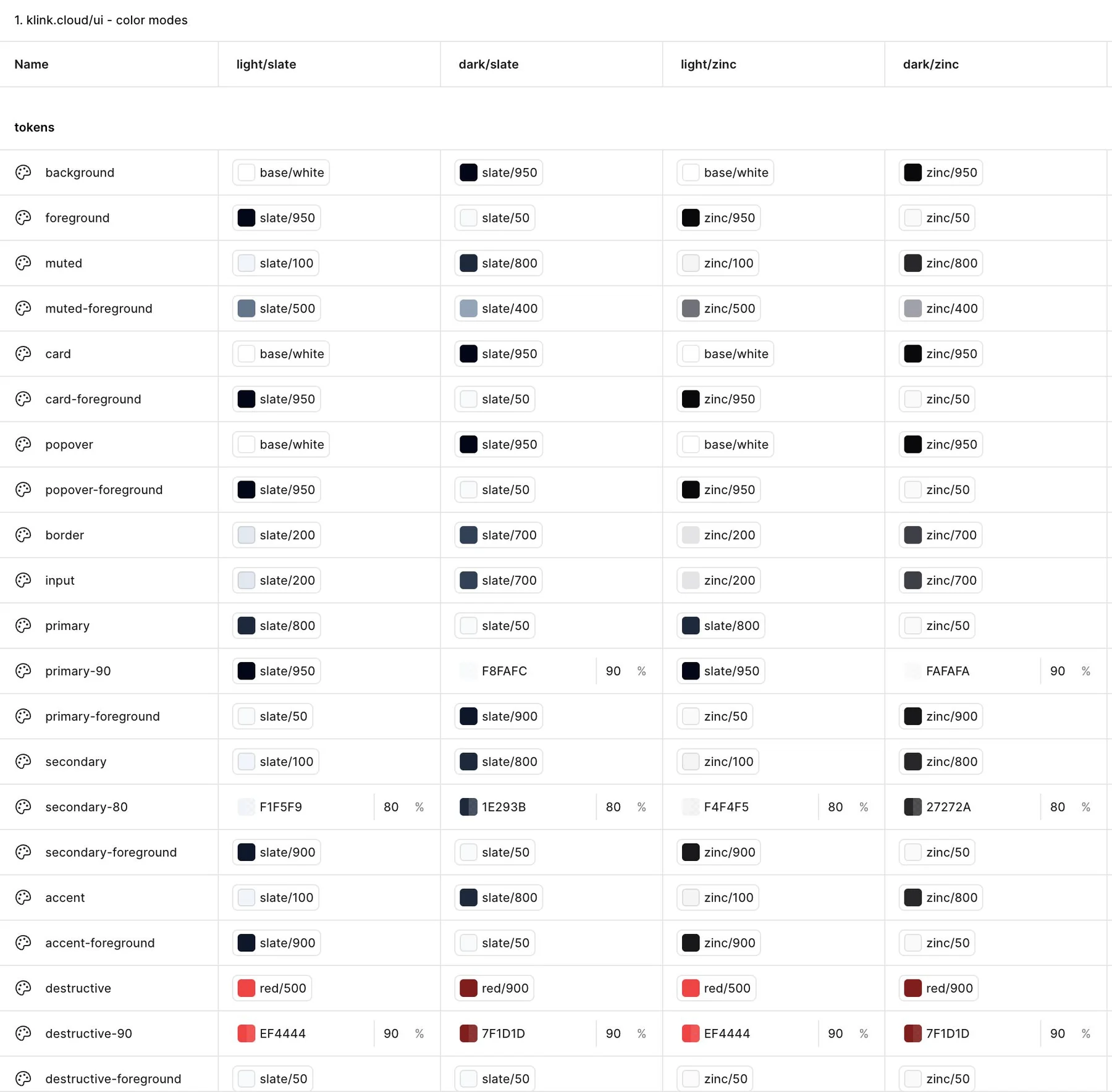
Every role has a value in each mode: light and dark, on a slate or zinc neutral base. Components read the role, the mode picks the value.
Rules for AI
Since 2025 I build Klink screens directly in code with Claude Code. The design system is written down as skill files and CLAUDE.md rules: use roles, never raw colors, use the scale, check both themes. So screens built with AI come out on system, in every theme and every brand, by construction.
- Use a role token, never a hex value
- Spacing, radius and type come from the scale
- Every screen is checked in light and dark
- Text on primary uses primary-foreground
My role
- Created the system: scales, roles, type, spacing, radius and shadow
- Designed the theming model for light, dark and customer brands
- Built and maintain the component library in code
- Wrote the rules Claude Code follows to build screens on system
Tools