Still landing page
Someone arrives from a link with no context. In one screen they should understand what Still is, see that it looks as calm as it sounds, and know where to get it.
- Role
- Designer and builder
- Product
- One-page site for the Still app
- Platform
- Web (one responsive page)
- Team
- Solo, just me
- Status
- Ready, store links coming
Try it
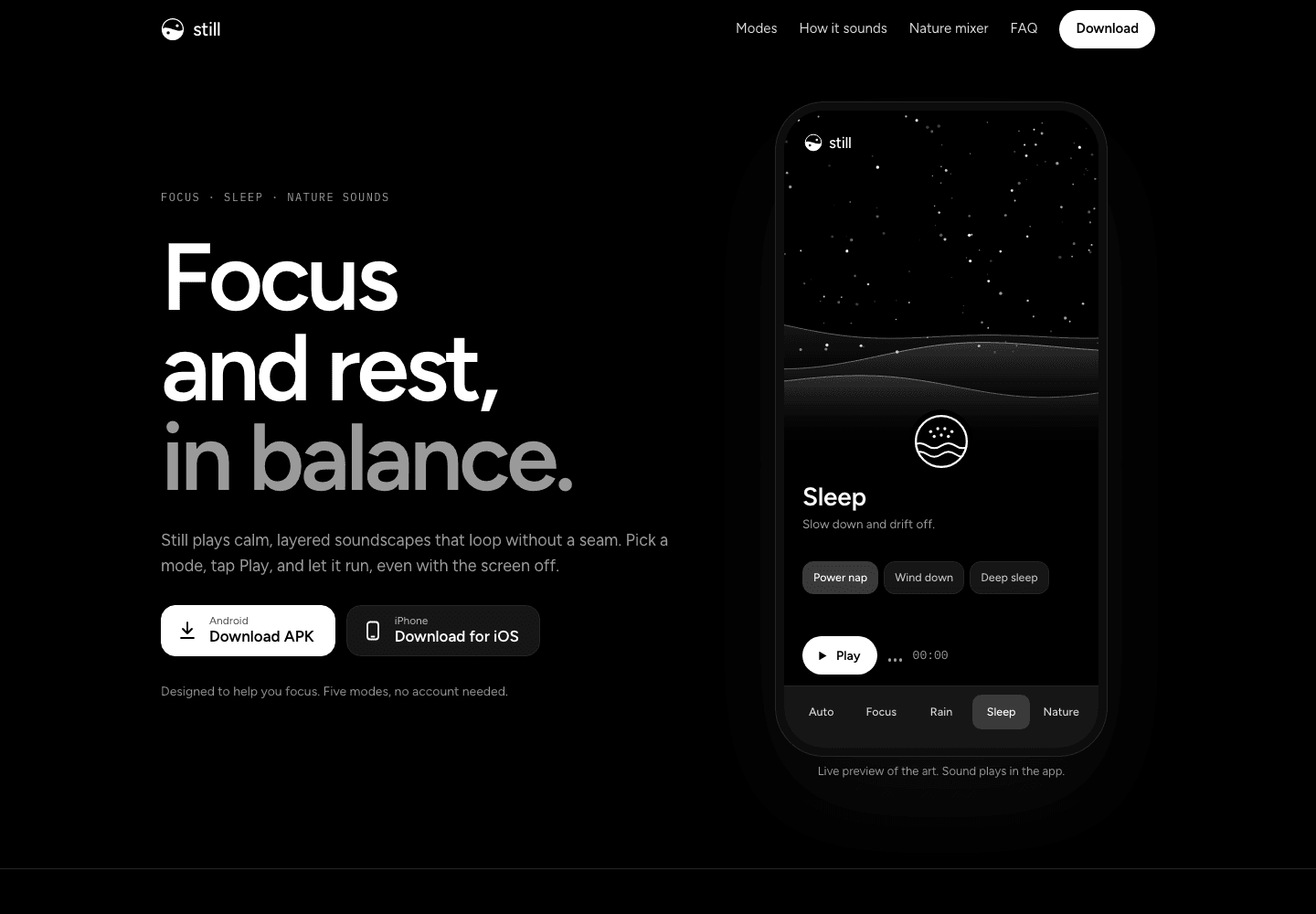
This is the actual page, running inside this one. Click to interact, scroll it, switch the modes in the phone, drag the nature pills.
Move the pointer out to scroll the case study again.Open the page on its own
The job
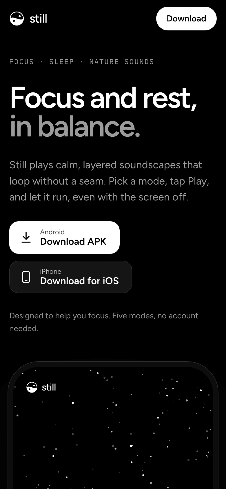
The landing page is a single responsive HTML page that I designed and built myself. It explains the app, runs the real art live, and says plainly what the sound can and cannot do.
- 1
- Responsive page, no framework
- 8
- Sections, hero to FAQ
- 5
- Modes you can try in the hero
- 4
- Nature sounds to mix on the page
Goals
- Explain it in one screen
“Focus and rest, in balance.” One line, one paragraph, one phone, two download buttons.
- Show the real thing
The phone in the hero is not an image. It is the app's own art, drawn live, with working mode tabs.
- Stay honest
“Designed to help you focus.” Never “proven”. The footer says it is not a medical device and results vary.
Page structure
Eight sections, each with one job. The page reads top to bottom as a short argument: here is the thing, here is how it works, here is how to get it.
- HeroWhat Still is, and a live phone you can play with
- Five modesOne card per mode, each with its own scene
- How it soundsThe layers, the 17 minute timeline and the beat behind each scenario
- The scienceFive animated brain rhythms, the binaural beat, and what the evidence does and does not say
- Nature mixerA working mixer: choose up to four sounds and drag their volume
- Made to stay out of your wayFour plain promises: no seams, screen off, sleep timer, remembers
- DownloadAndroid APK and iOS, with how to install the APK
- QuestionsFive answers, including headphones and sleeping safely
Explaining sound
Sound is the hardest thing to show on a web page with no audio. So the page explains it with the same diagrams the case study uses: the three layers, the music and beat loops that only realign after 17 minutes, and a table of the beat behind each scenario.
The hero preview says it plainly: “Live preview of the art. Sound plays in the app.”
Music, 51 s
Beat, 60 s
- 40HzGammaDeep work, Afternoon
- 18HzBetaCoding
- 16HzBetaStudy, Morning
- 10HzAlphaReading, Creative, Evening
- 6HzThetaPower nap
- 2HzDeltaWind down, Deep sleep, Night
Copy rules
- Hero note“Designed to help you focus. Five modes, no account needed.”
- Beat table“Best with headphones. The beat is on by default in Focus and off in Sleep. Results vary from person to person.”
- FAQ“Keep the volume low when you use headphones in bed, and set the sleep timer so the sound fades out on its own.”
- Footer“Still is designed to help you focus and rest. It is not a medical device, and results vary.”
- Download“The Android APK installs outside Google Play. Your phone may ask you to allow installs from your browser first.”
Quality
- Keyboard and focus
A visible focus ring on everything you can tab to, native details elements for the FAQ, and a live-region note when a store link is not ready.
- Reduced motion
With reduce motion on, the art slows to 0.2 times and smooth scrolling turns off.
- Small screens
The page collapses to one column, the mode cards stack, and the beat table stays readable down to phone width.
- No dead ends
Until the real links exist, the download buttons say “coming soon” instead of leading nowhere.
Next
- Fill in the real Android APK and iOS links.
- Add the app icon and store screenshots.
Tools